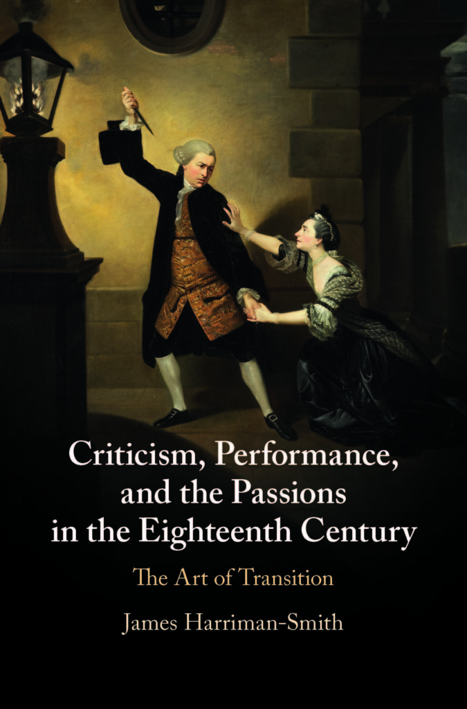
I really like the cover of my book.

I wish I knew the designer who put it together. I’d like to thank her or him for the way they lined up the foot of Garrick-as-Jaffeir so that it fits over the ‘f’ and the ‘o’ of ‘Performance; how they made the pedestal’s edge align with the ‘C’ of ‘Criticism’ and its shadow enforce the title’s first comma; and their choice of colours that recall the same hints and hues in Johann Zoffany’s original oil painting of Susannah Cibber as Belvidera and David Garrick as Jaffeir in act four of Thomas Otway’s Venice Preserv’d. If anyone from CUP is reading this, please do let me know.
I settled on this cover image fairly early in the process of putting my book together, and became certain that I wanted to use it in the winter of 2018-19 when – desperate to overcome my writer’s block – I fled my university office and sat in The Word library in South Shields, hunched over my laptop and endeavouring to force out a coherent and exciting introduction. Ultimately, I built that introduction around this scene from Venice Preserv’d, not least because Francis Gentleman praised Garrick for his ‘transitions’ in it, which, he claimed, ‘beggar’d all description’.
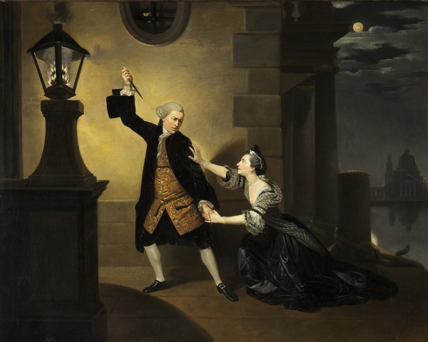
As for Zoffany’s painting of this moment, I refer to it explicitly as a way of talking about the overlap between theories of painting and theories of acting in the eighteenth century, and as a way of thinking about how an iconic moment can still be possessed with a kind of movement: do you notice how Garrick’s pose carries a lot of potential motion? or how the guttering fire contrasts with the paleness of the moon and the pallour of Cibber’s skin?
I admit that the moon is hard to spot, and here again I need to praise whoever designed my cover. The full picture looks like this.

Now the most difficult thing about this image is that it is wider than it is tall, and so has completely the wrong aspect ratio for a book cover. Even worse, two of the things I want to talk about (the guttering fire and the moon) are at opposite ends of this image. It was a fine balancing act indeed to get the fire and the moonlit clouds into this picture, while preserving the most important thing of all: the dynamic iconicity of this moment.
I could, of course, have chosen one of many of other iconic images of Garick. Laurence Marie went for Garrick as Richard III, while others have chosen this actor’s Hamlet or his Macbeth. But I didn’t want to put Shakespeare and Garrick on this cover: my book has a lot to say about Shakespeare, but it is above all about eighteenth-century criticism and culture, so it seemed fitting to use instead a play by an author whom eighteenth-century critics considered Shakespeare’s equal.
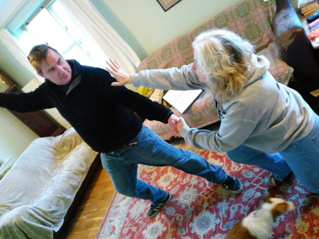
One final, much more personal reason for using this image is to be found in the connections I have made between it and the region in which I now live and work: North-East England. First of all, one of the version of this painting hangs in the Bowes Museum, about forty-five minutes drive south of my house. It was one of the centrepieces of an exhibition in 2017, and I’ve even given a talk about it. Second, and as part of this talk, I explored this scene with two amateur actors from The Castle Players, and with their help first discovered the peculiar tensions between the dynamic and the iconic elements of this moment.

So now you know a little more about the cover of this book. Zoffany’s image helped promote both his painting and Garrick and Cibber’s acting. I can only hope now that this eye-catching moment serves a similar purpose for my work…
My book, Criticism, Performance, and the Passions: The Art of Transition was published in March 2021 by Cambridge University Press. You can order it direct from the press, with a 20% discount, by using the code SMITH2021.
One response to “The Cover Image”
[…] the cover of my book, you will find five black-and-white images. They […]